 I found out about this artist from abduzeedo his name is Sebastian Andaur, and he is a self taught digital artist from South America. I found his work very colorful and he uses a lot of contrast. I like this image above because of the striking colors and also because of the way he plays with perspective.
Tuesday, February 28, 2012
Jordan 2/28
I found out about this artist from abduzeedo his name is Sebastian Andaur, and he is a self taught digital artist from South America. I found his work very colorful and he uses a lot of contrast. I like this image above because of the striking colors and also because of the way he plays with perspective.Design Inspiration - Amanda
I was looking around the web for web design inspiration and came across this site. The sites that this features are commercial but kinda cool at the same time.
Victoria Inspiration of the week

I did a little research the past week on imagery I can use as inspiration for my flash fiction Project. My story is based off the childs story of little red riding hood so I researched some images of her and I found this graphically pleasing image of her much like how she's portrayed in my flash fiction version of the story. I hope to incorporate some of this imagery into my piece successfully with her silhouette in part of it and the consistent use of the black, red and white colors. I want to keep it ominous and creepy much like this picture as well.
Monday, February 27, 2012
Landscapes out of Books

I thought this work by Guy Laramee was really cool because he takes books and turns them into landscapes and structures. He uses so much detail it looks amazing!
Here is a link to check out his website:
http://www.guylaramee.com/
Vaz_2/28/12


 I love anything to do with typography, whether it's researching it or designing it. I found these while researching for our website project dealing with typography. I thought they were really interesting with the types of fonts chosen for each one that fits so well to the words being spelled.
Sunday, February 26, 2012
COOL CLOCK :P

This really has nothing to do with the projects that we are working on but i just found it creative. One of the most unique clocks I have ever seen. I mean I guess it does has some sort of typographical design to it. See for yourself!
Thursday, February 23, 2012
Real life photoshop!
Check this out, someone laid out a real life photoshop desktop. It kinda blew my mind when I saw it.
Enjoy =]
Check this out, someone laid out a real life photoshop desktop. It kinda blew my mind when I saw it.
Enjoy =]
Tuesday, February 21, 2012
Matt Sheridan
I really enjoyed the lecture my Matt Sheridan last week. He seemed like a really cool and down to earth guy for all the success he's had. I was not expecting at all for him to have been an animator on Daria. That was one of my favorite shows when I was younger. It's also really funny that he directed Blues Clues for a while. It clearly isn't the coolest thing to be doing, but I can only imagine the money that could go alone with it. His art didn't fully make sense to me in the end. The figure drawings out of water color, however, I thought were incredibly gorgeous. His early work appealed more to me than his animated installation in the end. I like the idea of deconstructing paintings and strokes, but the music and dialog connected with the pieces just didn't work in my head. But I really think it was an inspiring talk and shows that people will have many jobs in this field and that doesn't mean they aren't successful. It's just getting your name and artwork out there for more people to see.
Tim Wood-Matt Sheridan
Although I wasn't able to make it to the artist talk I went to the gallery and looked at his work for myself. Overall I thought his three pieces of work were interesting with not only their subject matter but how they were presented. If I stood close enough to the wall where his work was being presented my shadow would show up on the wall and it felt like I was interacting with the piece. The one piece I really enjoyed was the "Chasing Tail" video. Even though I didn't know what it's purpose was until after I saw the video I was attracted to it's constant motion and how it literally looked like something chasing it's tail. After watching it for some time I almost became mesmerized with the consistent motions of the loop.
Monday, February 20, 2012
Sarah_Matt Sheridan Talk
I really enjoyed listening Matt Sheridan's lecture about his work and his journey to how he got to where he is now. What I got out of the lecture was very similar to the David Mazure lecture; keep all your sketches and old projects you thought were horrible or failures, because someone out there might think that it's the next great thing in art. Also I took out of it not to be afraid to take a chance with projects or anything that you do. I was really excited when he mentioned all the shows that he had worked a good chunk on like Daria, and Beavis and Butthead. Such well known shows that almost everyone watched after school on MTV, and here was the guy that did a good chunk of animation and layout on.
Sunday, February 19, 2012
Matt Sheridan's Talk
It was really nice to see somebody's work who is successfully working in the field of animation and is not limiting himself to doing work only for somebody. His talk about his work and his accomplishments was very impressive he clearly loves what he does and that's impressive. It was inspiring to hear him talk about projects he worked on like blues clues but he didn't limit himself just to that he wasn't happy and moved on to projects that keep him interested. It was also inspiring to hear that somebody who has graduated from Cortland went on to do famous things yet still be an artist building on his own work and working not only for somebody but creating own work that gets great reviews and is shown all over the world.
photography+typography=awesome

Saturday, February 18, 2012
Sheridan Talk - Amanda
I enjoyed Matt Sheridan's talk and approach to his work. I like that he doesnt limit himself to one medium and is willing to take chances, because that is how I would like approach my work. He takes his ideas and runs with it, which is cool/refreshing. I like that he never lost confidence in his work even when turned down by various institutions, I dont think that I would have fared that well. I like how he takes simple ideas and makes it into interesting work, that to me is very inspiring.
Friday, February 17, 2012
Matt Sheridan's Talk
Matt Sheridan's talk was impressive. It's cool knowing that he came from Cortland and is now traveling across the world creating art and presenting his work wherever he goes. The way he talked about himself and his work was a lot like how I talk about and refer to my own work so it gives me hope for the future. I think it's interesting that he had experimented with different mediums to get to where he is today. I enjoyed how simple some of his animations were because it shows that a little simplistic idea can go a long way. He talked a lot about his numerous projects and jobs and it opened my eyes to how hard this field can get. He also spoke briefly on the fact that he was laughed at and ridiculed by many in his process because of his youth and lack of experience, which I found helpful because that would intimidate me an awful lot. To know that someone quite successful went through the same thing is comforting to hear. Even his presentation was pretty surprising, he kept my interest by using a lot of visuals and comic relief. I couldn't believe he worked for popular TV shows like Beavis and Butthead, Blues Clues and more. Definitely glad I went to this talk, very inspiring.
Matt Sheridan- Artist Talk
It was interesting to hear where an animation artist gets their motivation for their work. It was creative for him to take ideas from the current events happening while he was in school. A lot of what Matt Sheridan was saying I could not connect with. For example his ideas stemmed from serious disasters such as 9/11 or Hurricane Katrina. However his thoughts were immature and not as serious concepts. Since those events were prevalent in his life at the time his feelings were all impacted by what was happening around him.
It was funny to me how he talked about his work as well. Synthesis, one of his pieces, received different responses. People either loved it or they hated it. Personally I thought it was a successful piece incorporating color and texture. Since it was only 2 minutes long the elements he incorporated in it were successful.
The animation that really caught my attention was "Curse of the Paper Tigers". This was a recent piece he created in August 2011 while thinking of Iraq and the war that our country has been in for years. The simplicity of the shapes really brought me back to multi-media where we learned how to give attitude to an object. This was an awesome concept because even though the viewer doesn't know what the characters are, they still have tremendous emotions.
Thursday, February 16, 2012
Jackie_artist talk
Matt Sheridan's artist talk was very informative and interesting. What I got out of it was that the biggest thing is to believe in yourself and to never give up. He has done so many different things since he has graduated. He has created pretty much every form of art, and has experimented with many different mediums. I think an important thing to remember is that you may not always be completely confident in something you do, and you may think that certain goals may be impossible to reach, but other people might be completely inspired by your work, and you could end up getting recognized for it. You just need to believe in yourself, and believe that someone in the world is going to be inspired by your work somehow. This is personally what I need to work on.
It is also interesting that he has had so many jobs already. When he got sick of one, he would always find another. I think this is inspiring, because I have been worried about what exactly I want to do. But it takes a while to figure that out, and it also takes trial and error. You don't have to be set to doing one job the rest of your life. It is better to quit, and find something that makes you happy, than to stay at the job that makes you miserable. Plus, I think the more experience you have, the more well rounded you can become as an artist.
Matt Sheridan at Dowd
Matt Sheridan's lecture at the Dowd Gallery was very interesting and impressive. It was great to see that someone from the Finger Lakes New York can travel across the world, work on television series, and be a recognized artist. He also made it clear that you don't have to stick to one type of art technique or work/job. When he got tired or bored of one job he managed to find a way to a new work environment that was more appealing to him at the time. Matt Sheridan also played with his own personal art techniques and methods to figure out what fit him. Change is good in artwork, and consistent change brings out how that artist is feeling at that current time. How people feel changes and their artwork shows it, and for Matt Sheridan he found that a change in jobs as well as personal artwork can take you where you want to be in life.
Something interesting that I took away from the lecture is that even though you may not find a certain piece of artwork you created amazing or perfect, doesn't mean that someone else won't be inspired by it.
Something interesting that I took away from the lecture is that even though you may not find a certain piece of artwork you created amazing or perfect, doesn't mean that someone else won't be inspired by it.
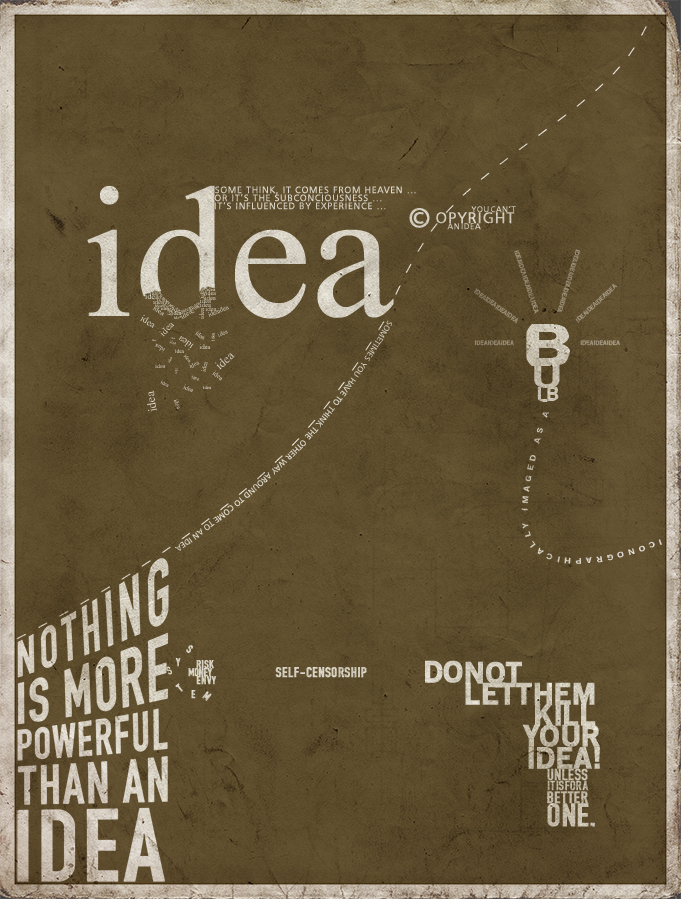
 I chose two images because each one has a different quality than the other, but are both qualities that I would like to use. This one creates an image with the words and letter while still giving a very powerful message. The other piece that I choose is the same in that Tim picked, and I liked it for the same reason. The text is used in a way that it is activated and comes to life. Using the text in this way makes the reader more interested and involved in the piece.
 Wednesday, February 15, 2012
Tim Wood - narrative typography
"Pocket Watch"
 I wanted to use these two as examples because I really enjoyed how the words and type were changed to fit the words and/or the theme of the overall narrative. I chose "Pocket Watch" as one of my posts because the designer uses the type in a way that allows the viewer to understand the poem while keeping them active. The type causing the viewer to move around the screen and pay attention because some parts of the narrative are quick.
I chose this posters as my second choice because I like how each word is different. Whether the difference is with the size of the text or the font type by choosing to make the poster this way it keeps the viewer interested. If this poster had the same words but were the same size, font type, and were positioned the same way the poster wouldn't be as effective.
I wanted to use these two as examples because I really enjoyed how the words and type were changed to fit the words and/or the theme of the overall narrative. I chose "Pocket Watch" as one of my posts because the designer uses the type in a way that allows the viewer to understand the poem while keeping them active. The type causing the viewer to move around the screen and pay attention because some parts of the narrative are quick. I chose this posters as my second choice because I like how each word is different. Whether the difference is with the size of the text or the font type by choosing to make the poster this way it keeps the viewer interested. If this poster had the same words but were the same size, font type, and were positioned the same way the poster wouldn't be as effective.
Tuesday, February 14, 2012
Here there are many concepts from many different artistic angles. Posts are coming up regularly, so are new sketches, and finished pieces from the artists.

This SDC seemed to fit with this program, it gives students paths to consider. The site is easy to navigate and they layout set for success, it is rich in color and detail.


This SDC seemed to fit with this program, it gives students paths to consider. The site is easy to navigate and they layout set for success, it is rich in color and detail.

Narrative Typography Reasearch

http://www.adhamdannaway.com/
http://www.bowtieperiod.com/
Monday, February 13, 2012
http://www.stumbleupon.com/su/1ZXuC3/darkpsychedelic.ru/FV_18.html/
http://www.stumbleupon.com/su/7WwfFa/www.nawlz.com/
Both of these websites incorporate color and movement for an interactive feel. By viewing these two websites it reminded me of some of the first digital art animation. When computers first were popular a lot of artists created work to show the viewer what they could do on a computer. Therefore when seeing works such as these two I feel artists still take that mind set into consideration today.
Project 2 Research
2 Examples of narrative typography:
I found this piece of narrative typography which I think is great example of the project we're about to partake in. The way the text is laid out reflects the movements in the story, which is what i'd ideally like mine to do as well.

I found this piece of narrative typography which I think is great example of the project we're about to partake in. The way the text is laid out reflects the movements in the story, which is what i'd ideally like mine to do as well.
I also found this narrative typography in which the text portrays the feeling of a cold winter day. I enjoy it's simplistic font with the intricate detailed within some of the letters.
2 Non-Commercial Websites:
This website is a portfolio I found that incorporates his work into the website itself, which better showcases his work. His personal aesthetic is clear and consistent throughout the entire site which is nice.
Here is another portfolio site that I thought had a unique layout and setup. I liked that the image was interactive and the buttons were a part of an image she created.


Anna - Non Commercial website examples
This is an example of a digital portfolio that caught my eye because of its simplicity. 
This website is also an example of a digital portfolio but I liked how it was set up and how every project shown told a story.

Narrative Typography & Websites - Amanda


I saw the left image one on a friends facebook page and really liked the infinity symbol with the words, its simple but I think it works. The right one I saw while looking for narrative typography, I really like the way the type is laid out and how it dies give you a sense of a story.
I found a non-profit website that I thought was presented well. Its focus to help you realize what your carbon footprint is. You can see it here. Another site that I thought was fun was for the New England Aquarium in Boston. I went here a few years ago and picked up some pretty cool brochures and decided to look at their site to see if it lived up to my expectations, I think for the most part it does, I like that it gives you a look inside the aquariums exhibits and it is easy to navigate through. You can see it here.
Typography Tales

It is hard to find places in a big city without typography giving you options on what to do, where to find it, and what to expect. The typography here is kept as simple yet legible, trying hard not to confuse the average traveler. This may be in German, but if I knew the names of where my Subway journey began and ended, I believe I would make it. Color-coded locations and lines make all the difference here.

Sunday, February 12, 2012
Jackie_typography
 I found this really interesting. I like the use of black in the hair and different shades of grey in the face, it gives a nice contrast. I like the look of building up a lot of text to get shading in certain areas.
This is so cute, I couldn't resist. But the most interesting typography to me is typography that takes on the shape of an object or person. It's a clever way to help narrate a story about someone or something, and to use imagery without using actual images.
Jackie_websites

I found this really cool website where you can explore a ton of different works in a category, such as typography. And there are a few categories to explore. The image is from a really interesting animation. It's right on the first page and is called coral type, click on it and check it out.
This artist is extremely interesting. His website is very out there, weird, and creepy but it kept me interested. Just check out his page to see how weird it is.
Saturday, February 11, 2012
Vaz_narrative_2/14/12

 These two narrative typographic designs interested me in that they only used black and white colors and not crazy, over the top colors. The first one I liked because of the different sizes of the text throughout the image is successful in the story. The second one I liked because of the imagery made out of the typography, which is something I like doing myself. It also sends an important message to the viewers as an informational poster.
Vaz_2/14/12


Friday, February 10, 2012
AIGA Gallery
http://portfolios.aiga.org/
 This website has numerous gallery topics. Just select a topic you want to see (ceramics, computer animation, music, etc.) and it will bring up every image/video/project they have on the topic. If you really like a specific work of art you can go to the artists information page on the site. It gives you basic information about them, more of their work, and a link to their personal website if they have one.

Typography & Concept Driven Websites
Typography
I thought this was a really fun image. The words are all showing their emotions and there isn't any pictures in this, and there doesn't need to be. The words themselves are telling the story perfectly.


Concept Driven Websites
http://cargocollective.com/fffarrr#990308/Narrative-Typographyhttp://cargocollective.com/biancamuto
The links above are non profit websites that each have there own unique design to them. I really like the second one because it is very easy to navigate through. It keeps things simple but appealing to look at, unlike the link posted below. The link below goes to a website that had too much going on, it was personally difficult to navigate but I thought it was interesting to see what an overwhelming website looks like.
http://e-jori.com/flashdesigns/oldfolio/premiere.htm
Thursday, February 9, 2012
Narrative Typography - 2 examples

This is an example of a typographic comic book. These comic books use typography in place of imagery as the primary method of storytelling. I think this idea is interesting to have a type-only comic book.

This piece was created by William Ratke using Illustrator, Photoshop, and Flash. It is a short visual piece that follows the narrative The Box in the Orchard by Bob Drake. He experimented with multiple fonts together in the same word to create visual impact.
Tuesday, February 7, 2012
David Mazure
The David Mazure collection was one I hadn't seen before and one that really intrigued me. I thought his work was really original. Although I am upset that I didn't get to hear him talk, after doing research on him and his work I can see how my thought process is not far off from his. In his artist statement he says "I am interested in what lies beyond human knowledge and the limitations of the human mind to acquire knowledge." I am also constantly pondering this statement and find a lot of my recent inspirations to be about things that can't really be explained by human knowledge. I think that mixing science, art, design and western philosophy is what really makes his work is unique. His piece titled Transmeanderation was such an intricate and large piece that I learned continues onto different sections to accommodate certain site-specificity. I wish it wasn't ever cut up though, I wish it was completely laid out the way he intended it to. Aesthetically, I did love the piece. I loved the simple black on white with the extremely complex and intertwining use of line. The complexity of the drawing really exaggerates what he was trying to get across which was an anticipated memory of the viewer. I think that his work is really fascinating and thought provoking along with the rest of the Innovations shows. It was one of my favorite gallery collections ever.
Monday, February 6, 2012
Artist : David Mazure
David Mazure has an intricate angle on the way he pursues his work. Struck a chord when he felt hanging on to artwork of the past is a good idea. That can be overwhelming though. I tend to do just that, but now I will probably go back and crop out the good stuff and modify it. I jived w his "process" of utilizing time, tools, and thought. I have difficulty finishing personal projects, but I am getting in the habit of completing a series of mini projects that are done with more speed and completion, instead of a piece missing. He was inspiring and he got my wheels turning on my next art endeavor.
Artist Lecture Reaction
I really liked the creative process David had and all his quirky views behind his work. I loved the organic looking shape of the helix piece. It was really inspiring at how successful he is and how young he was. Being featured in 7 exhibitions a year is really impressive and very intimidating as a young artist. I don't view myself as an "artist" in the sense of actually being featured in a gallery show. I was very inspired nonetheless and the process behind his art made me think about how drawing and graphic art can be mixed.
Tim Wood - David Mazure
Overall I thought the artist talk was fantastic. Mazure's thoughts about an artist's process and how important it can be to their work was really eye opening. One aspect of the presentation that turned me off was, as an artist who wants to focus in photography
his ideas about an "artist's process" didn't reach out to me. I
understood that there are many things that one can prepare before taking
a photograph but for my style I didn't really pull my attention;
however, once he started to show his work and the processes he's gone through to create his work I became more interested. I thought that his work was so original and inventive that it made me start to think about what I could start to do with my pieces. The way that he combined two things, science and art, together was extremely interesting in not only how he related to the two subjects but how they worked together to create wonderful pieces of art.
Awesome Reference - Please Read
Offers Information on:
- Top 10 Websites for Designers
- How to Create a Winning Proposal
- 3 Proposal Follow-up Tips
- Web Design for Beginners
Saturday, February 4, 2012
Jordan A. - Artist Talk
David Mazure’s talk about the process that he goes though was very insightful to how much time he puts into his work Transmeanderation Helix. I especially enjoyed how he walked us through step by step. Seeing the transformation of his work from starting off as hand drawings and then how he developed them into the final piece. I like how he talked about harvesting his hand drawings for the most interesting areas. It was also intresting how he used many different mediums from drawing to the computer then to drawing it again. One thing that I learned from David was to never throw out your work even if it is not used because you’ll never know when you can use it again.
Amanda - Mazure Talk
Im so glad that I did go to this Artist Talk. David Mazure's lecture on the creative process was inspiring to me because I had lost touch with my own creative process and knew that I needed to reconnect. Coming from the strict graphic standard/fast-paced work environment that I'm in doesn't leave much room/time for outside of the box thinking/brainstorming, which is something that I am looking forward to changing.
His work is amazing, looking at it you wouldn't know that it had grown from sketches of the human figure. I love the fluidity of his pieces, which is something that I like to do in my own "doodles." I like that he involves science into his art and that once he broke down the figural shapes and turned them into line drawing, he thought they resembled a DNA double helix, which circled back to the beginning of his sketches of the human form.
Friday, February 3, 2012
Vaz_Lecture
First seeing David Mazure's work on the wall, my first thought was that it looked like black smoke design. After seeing how he came up with the idea and the process he went through in creating how it looked as a final piece, blew me away. To see something complex as the human body drawn, mutilated, and twisted into each other to form this helix structure. My thought was " Why can't my mind process an idea like his?" Overall I really liked his lecture and him revealing the magic behind creating a piece that looks like it was made with such little effort, to explaining the hundreds of hours spent on it. Definitely take his advice with keeping my sketches and not throwing them away, but instead work from it to improve.
Innovations Gallery: David Mazure
I learned so much by listening to artist David Mazure last night for only a short time. His use of inspiration in the sciences really interested me and I felt it was very unique. The piece that he created for his friends was unlike anything that I would feel comfortable doing for one of my friends. Taking pictures of his two friends embracing on a bed wearing minimal clothes is an uncomfortable experience to be involved in. I realized after his presentation that this is one of the sacrifices that an artist has to make in order to complete a successful process and a final piece. It was also a rewarding experience for me to hear David Mazure explain that even after 100 hours of hard work and trials he still created a failed project. By hearing this story it comforted me to realize that not everything works out the way that you want it to but nothing goes wasted. Overall David Mazure was an interesting artist to listen to. "Dynamic Mapping" his made up word for tracing body movement, was a cool way to create his own style of artwork. The fact that he made up his own word shows his style as an artist as well. He is carefree in all of his ideas but continues a straightforward process with each of his pieces. This artist talk really inspired me to continue a hardworking process for all of my projects for the rest of my career as a Designer.
Thursday, February 2, 2012
Jackie_Mazure response
I thought that David Mazure's work was so unique and nothing that I have ever seen before. When he was explaining his whole process, I thought it was so interesting that he starts from human form. When I first looked at his work on the wall in the gallery, I would have never guessed that he started out from studying human form. At first, I thought it was just a really interesting ink drawing that was just meant to be an abstract drawing. Once I realized that there was so much more to it, the shapes in the drawing really resemble the human form in an abstract way, which helps to bring imagination into the observation of the piece.
He was very inspiring to me in the fact that you should never doubt yourself or your work. I think his advice to keep your process and all of your work was really helpful. You never know when you will look back on something and spark an idea based off of your old work. It's amazing that he can keep getting so many ideas for new projects based on one idea or drawing from a past process. I think that your artwork is all part of one big process, and it helps you to keep growing.
Anna: David Maruze lecture
It was really interesting to hear a lecture coming from an artist who actually works in the field of design. David Mazure's work is fascinating. From first look I did not think that the work displayed in Dowd Gallery had anything to do with human form, however as he took us through the process of making the piece is became more and more apparent as I kept looking at the work. The way he uses human form to communicate the abstract forms is inspiring.
I also valued his presentation for the explanation of how important the actual process is. It made me think about my own process of work. It made me realize that maybe I'm closing myself in on a single project at once without thinking about past projects or experiences. I thought his talk was inspiring, it made me think back on what I could have done differently on various projects.
It was very good to see an artists talk to us about his work and share his process with us.
David Mazure at Dowd
David Mazure's lecture at the Dowd Gallery was really insightful because every part of the design process is important. Reaching the final design is the goal but each step can be used in other works of art. Combining different designs from different stages can be one way to use all your work. You can also use the sketches or rough drafts from old projects to inspire new projects. I also learned that just because you may spend "100 hours" on a project does not mean that it will always be successful, but it also doesn't mean you should throw it away. Each step to a process is your creation and if it doesn't become useful for your current project you may find use for it later.
David Mazure's piece shown in the gallery "Transmeanderation Helix" didn't start as a 35 foot piece and definitely wasn't originally planned to be that long. He started with a smaller piece of it and liked it, but it turned out that he liked it even more when it was repeated multiple times to form the 35 foot piece it is now. Just because he liked it the way it was didn't mean it couldn't be better. I think it is good to expand on an idea that you like and not stick to your first plan. If you at least try expanding on your design you will know if you like your original piece the way it is or not.
Subscribe to:
Posts (Atom)